During the pandemic, the New York Times tried several unconventional attempts to illustrate severe and astonishing aspects of its influence. On its front page, the list of names took over the front page. Or they emptied the nearly one-third of a page to illustrate social distancing.
The New York Times and Social Distancing
Delivering a powerful message with a simple design

The New York Times illustrated social distancing through its eye-catching design. The Times allocated a significant portion to illustrate self-isolation. The design is simple but intuitive, making the message powerful.
You can read the full article here: Wondering About Social Distancing?

The paper presented a numerous loss of lives from the pandemic in a solemn way
Dedicating a whole page to the names
In the same month, The Times demonstrated the damage of pandemic in a distinctive way using its front page.
Normally, articles headlines, photographs, information graphics appear on the first page. Especially, photographs and visual graphics come on the front page on Sunday. Instead of these elements, a list of people who lost lives due to the Covid-19 took over the whole front page.

This was when the death toll from coronavirus in the United States approaches 100,000, and the paper demonstrated this national loss in a solemn way. They gathered names of the dead and memories of their lives from obituaries and death notices from various sources. According to the New York Times, Alain Delaquérière, a researcher, compiled a list of names. Then a team of editors and three graduate student journalists compiled personal data that depict their lives from newspapers and online sources.
You can read the full article here: The Project Behind a Front Page Full of Names
The surge of unemployment
In March, 2020, unemployment claims almost reached 3.3 million due to a widespread economic shutdown brought by the Covid-19. That’s about 5 times more than the number of previous highest unemployment claims, which was 665,000 in March 2009, during the recession.
To visualize this soar, the Times gave its right column to a graphic that goes all the way up to the right side of the page. This soaring graph marks how the economic toll was stark at the moment.

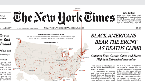
Death toll spiked through the logo
Three thousand more people died in New York City between March 11 and April 13. (The New York Times) When the death toll spiked in New York city, the New York Times mapped the coronavirus toll across the country with spike visual elements. In the map, New York City’s fatailities spiked through the logo, making the focus clearer.
The unconventional graphic presentation, the key to make your content stand out
The well-made design brings into clearer focus the facts and key messages. As seen above, no matter how simple that is, a well-designed graphic tells you the stories behind the text, inspire your thoughts, and deliver the unseen messages.
This is why design has become key for many media content. Even the New York Times utilized their the most precious real estate, the front page, in an unconventional way to grasp reader’s attention and convey meaning effectively.
